Prepared for

Product Designer · March 2027

From the firstconversationto a live release.

Hospital teams in Casablanca. Employees in Marseille. A VC fund in Paris. My goal is to design products that help and delight the end users.

SituaTrack · Hospital · Casablanca

Thoroughness over speed.

01

Reports were arriving late, or not at all.

Intern doctors at Cheikh Khalifa and Mohammed VI took notes on paper or in phone notes, then transcribed them twice at the end of the day: into an Excel report and into an outdated hospital ERP. Everyone used their own format, so reports were incomplete and inconsistent.

Professors complained. Residents spent their time fixing errors. Sometimes a report took three days and a confrontation to arrive.

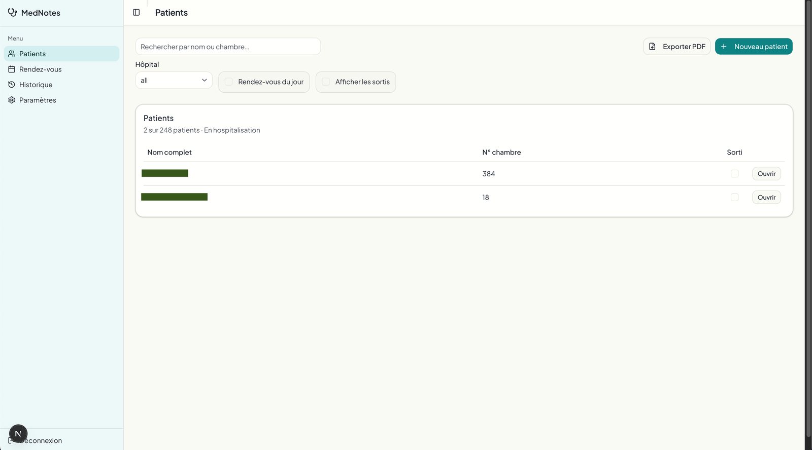
Users could only react to something real, and I had no access to the hospital ERP. So I skipped mockups. I shipped MedNotes, a single-user tool for the first resident, in two weeks. Once the team adopted it, they named it SituaTrack, because it tracks and reports the day’s situation. Field feedback drove everything after that.

02

Three jobs, one record.

Interns need to log consistently, with less double entry. Residents, the middle managers, want fewer errors to fix and faster onboarding. Professors want clean, consistent reports and usable data for research.

I spent a week in long interviews with a resident, who described the pressure from both sides. Quick, informal conversations with interns and professors continued through the build and became my feedback loop. 10+ doctors. 248 patients. One week of discovery, three months of iteration. I was the product designer and the developer.

03

I expected fewer clicks. I was wrong.

My marketing reflex said stressed doctors need minimal input. They wanted thoroughness over speed. Printing and research were core needs, not extras.

Status and presentation mattered. I wrote 364 rules to auto-style medical terms so reports read well, and a daily “Hello Doctor / Professor” greeting delighted users more than most features.

04

Morning: the situation du jour.

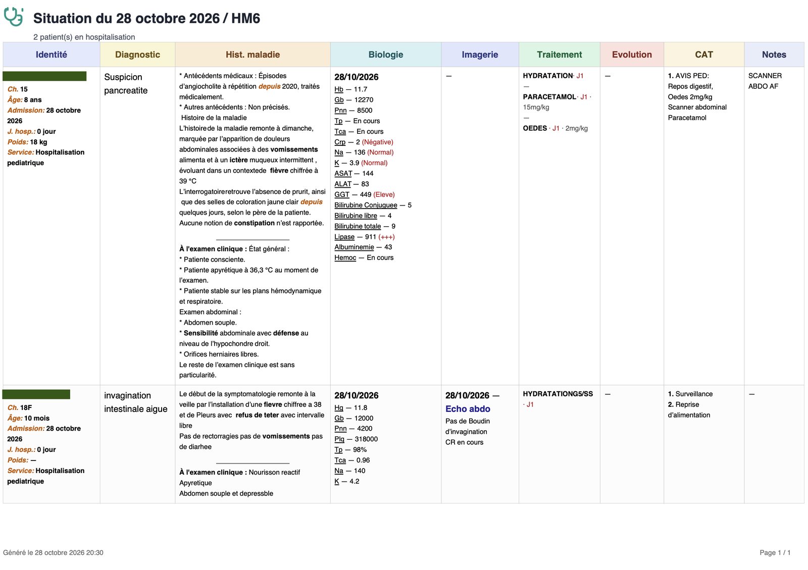
Login, and export the situation du jour as a PDF, printed for rounds.

05

The round happens on a phone.

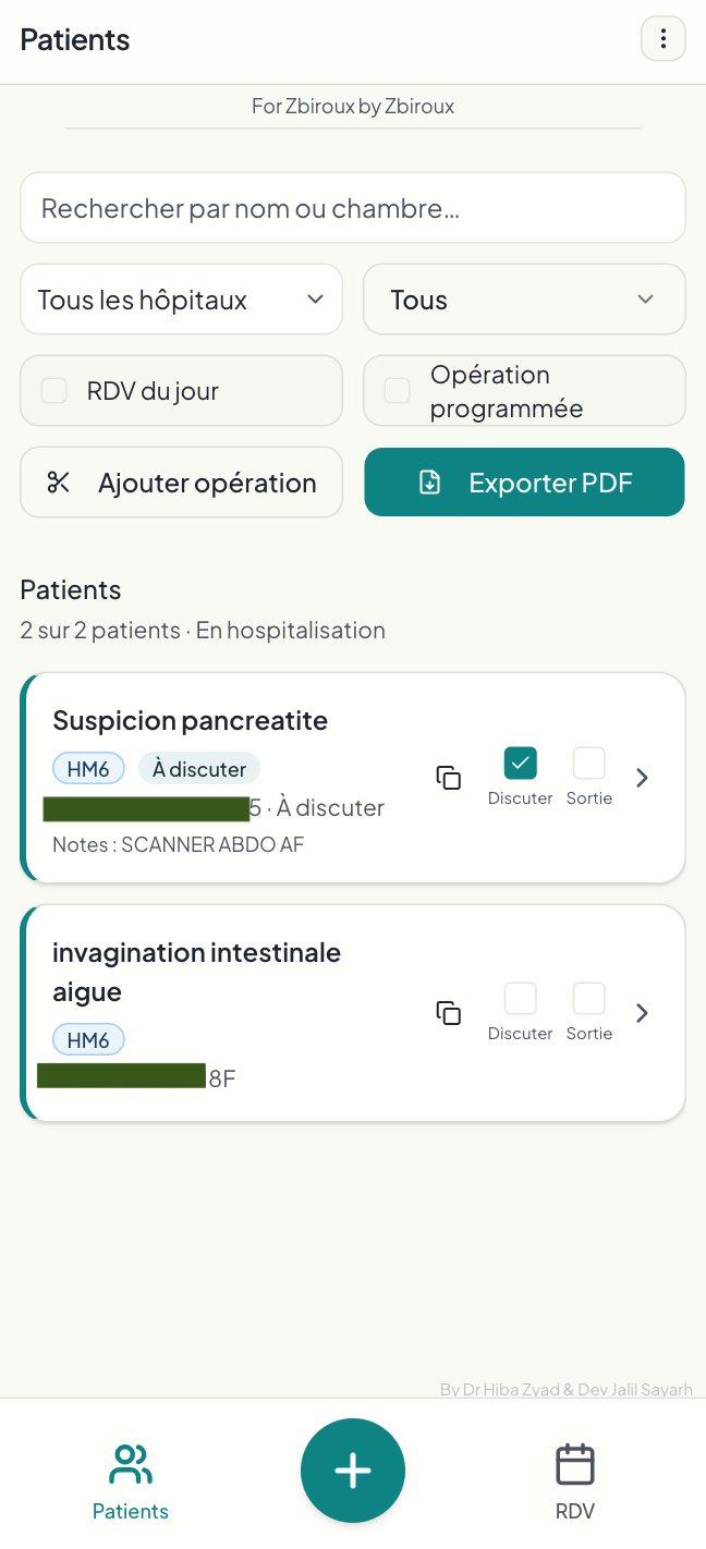
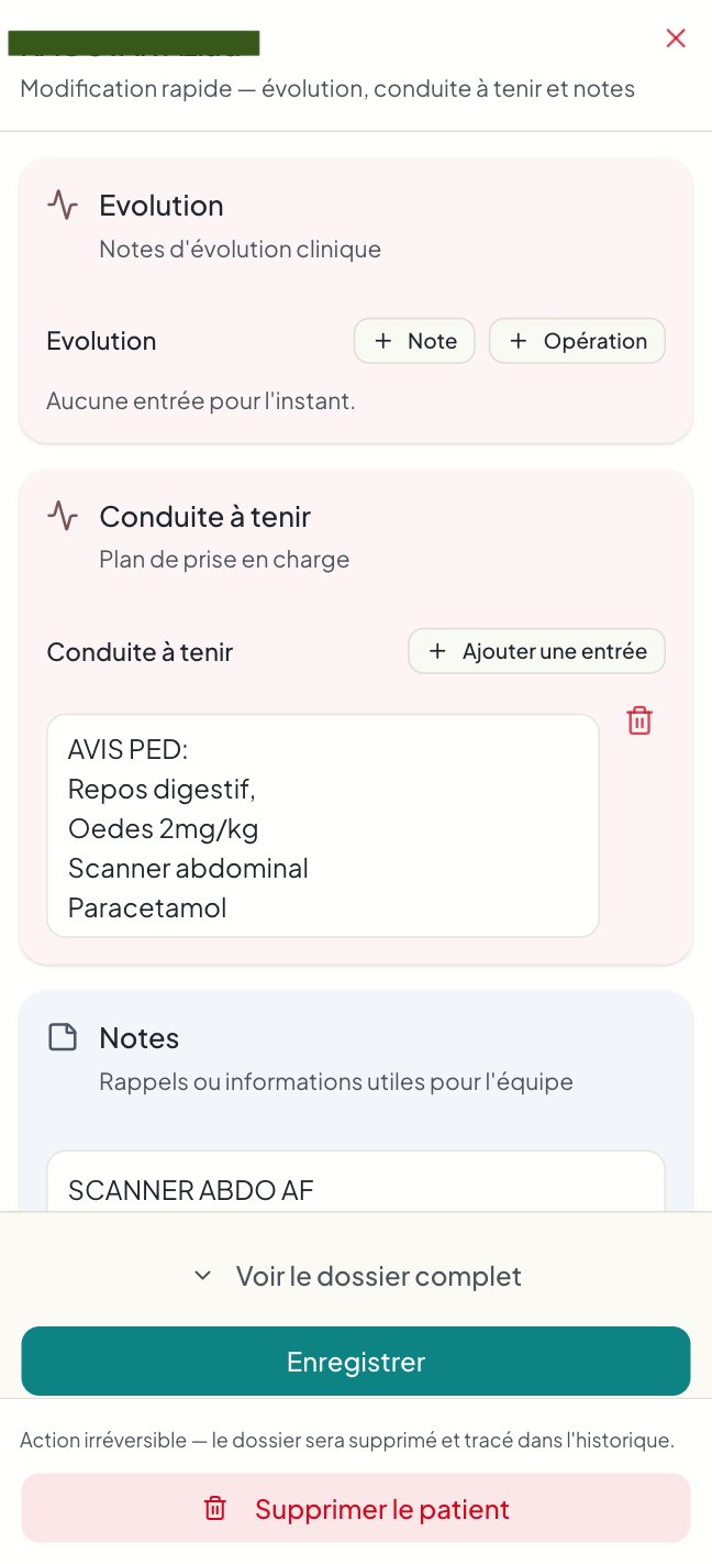
During rounds, notes are taken on the phone, and patients are flagged “À discuter” for the team brief. At the end of the day, the entries are checked on phone or laptop and the report goes out in one click.

06

The list is ordered the way memory works.

Diagnosis first, name second. Doctors often forget a patient’s name but never the diagnosis, so the cards lead with it. I kept the detailed forms and made them faster to complete.

With no ERP or barcode access, an OCR JavaScript library auto-fills patient data from tags. It is less accurate than a vision model, and it keeps entry fast. “À discuter” lets the team prioritise cases for briefs and meetings.

One-click copy sends the record back to the hospital. The app generates a full profile in a predefined text structure, ready to paste into the legacy software. This removes the worst part of the double entry.

07

After month one, the ward asked for more.

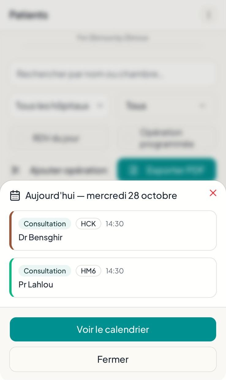
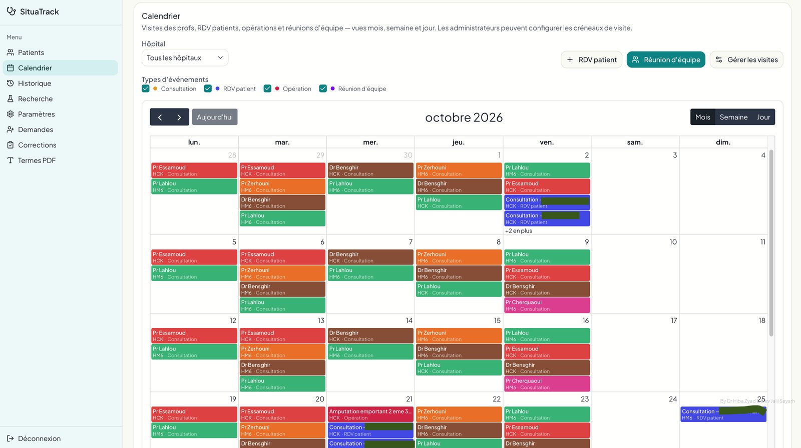
V1 covered note-taking and PDF export. After month one, doctors asked for appointments, a calendar and research. It started as simple appointment management and became a calendar for professor visits, team meetings, patient appointments and scheduled operations.

The desktop menu grew from 4 to 8 sections. On mobile, secondary features moved behind a header menu, keeping Patients, Add and Appointments in the bottom bar, with all 4 main pages always on display. A professor who only follows oncology patients can create that filter and reuse it. The most important information moved into the main row, after the doctors asked for it there.

08

A wrong deletion cannot be the end of a record.

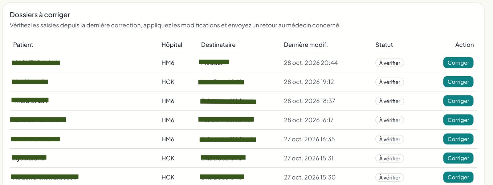
Admins can roll back any user action in one click, so deleting the wrong patient is never permanent. Residents are the admins. Only they approve new accounts, with a notification on connection and a smartphone push when the email is confirmed, so the list cannot be spammed.

My developer account only sees anonymised names and images, so I never access identifying or distressing content. Each profile sees a specific set of pages, with different access roles and strict row-level security.

09

Time came back, and the arguments stopped.

Estimated from the team’s own accounts: 1 hour a day for each intern on reporting. 15 to 30 minutes for residents who no longer fix reports. 15 minutes for professors when errors used to surface.

Reports now arrive daily with one click. The unit dynamic changed too: less tension, no more arguments over who fixes what, clean reports for professors, and data ready for research. Staff from other services have asked about the tool.

A resident, after month one: “I stopped filling out the forms, now it’s all the interns’ job, I’m so relieved. Everyone is thrilled.” An intern: “The site is incredible.” A professor, on the research feature: “Plus j’y pense plus je trouve que ça a un potentiel de fou.”

10

What I took out of it.

My 3-click rule was the wrong heuristic for this audience. I now ask what “good” means to the users before designing. Building directly gave fast feedback but left no design artifacts. Next time I would sketch flows first and keep a decision log.

Status and protocol are part of usability for hierarchical professions.

Full SituaTrack case →
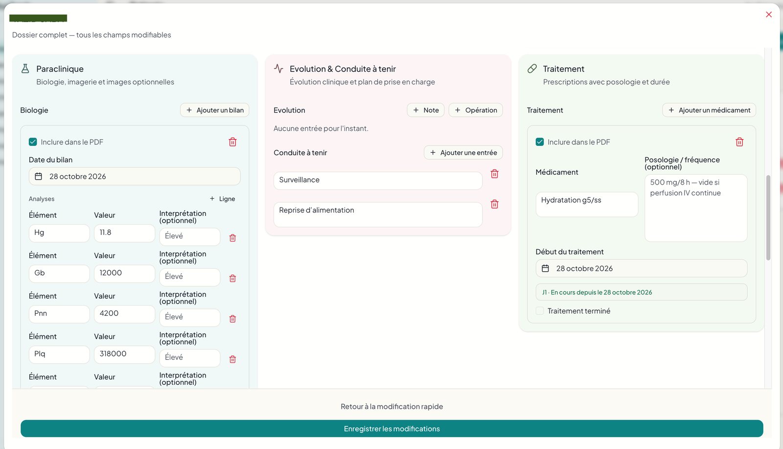
MedNotes desktop patient list, an early versionSituaTrack full patient record on desktopSituaTrack greeting: Bonjour DrSituation du jour exported as a PDFSituaTrack patient note on a phoneSituaTrack mobile patient list, diagnosis firstSituaTrack calendar for visits, operations, and meetingsSituaTrack corrections, so a deletion can be rolled backSituaTrack greeting shared in a message: Bonjour Professeur

CMA CGM · Hackathon winner · Marseille

Adoption was the risk.

01

The routes were a data problem. Taking them was a product problem.

CMA CGM wanted a mobility plan for its Marseille employees to cut its carbon footprint and reduce commuting subsidies. A shuttle service solves this only if people choose it, so adoption was the main risk.

The data team could find the best routes. My job was to find out what would make people take them, and design the experience around that. Three weeks. Albert School and Mines Paris. Two data scientists, one sustainability expert. I was product designer, frontend developer, and survey co-lead.

02

We could talk to managers. The employees were on LinkedIn.

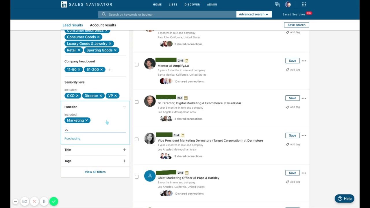
We had addresses and current transport modes, but not what employees thought. During the hackathon we could only speak to a few middle and senior managers, so I co-led a survey with the sustainability expert, reaching 121 CMA CGM employees in Marseille through LinkedIn.

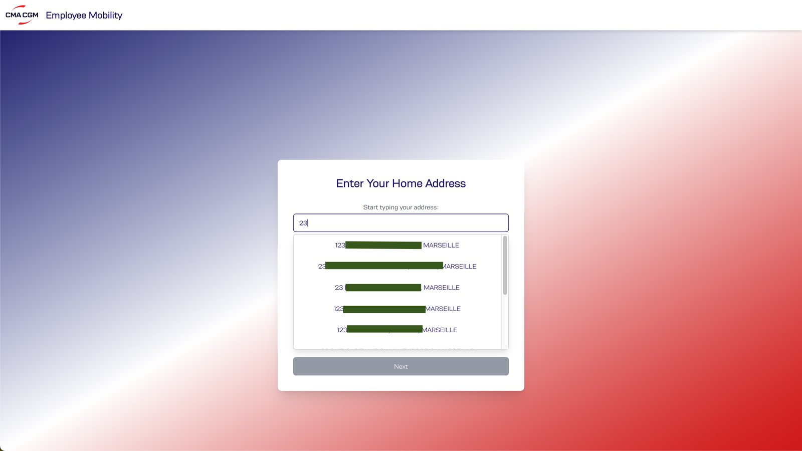
We asked whether they would walk to a pickup hub or want home pickup, how long a ride should take, and what they pay now versus what they’d pay. Ideally, the address would be mapped from the employee’s account and the app would only ask for confirmation rather than selection.

03

121 answers became the rules of the service.

Most surveyed employees support a shuttle, as long as it doesn’t cost more than they pay now after reimbursement. Average public transport cost is €39.25 a month before reimbursement. People would walk to a hub, up to 15 minutes. No one carpools today.

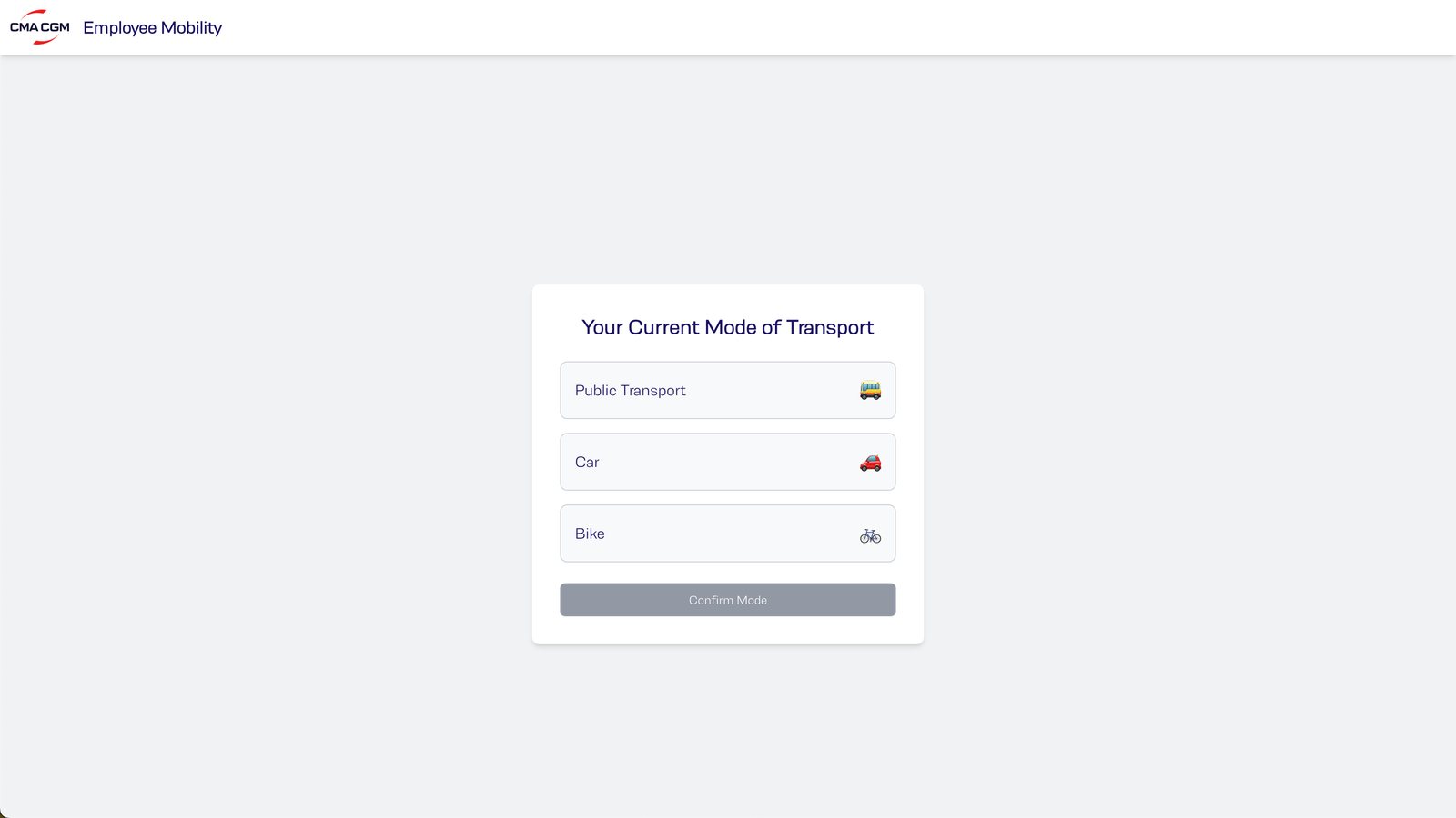
Average willingness to pay was €18.75, close to the real cost after the 50% reimbursement (€19.6). That set the pricing logic and the co-financing scenarios for CMA CGM. Hub-based model, 500 m maximum walking radius. Don’t rely on carpooling. Offer a better alternative. The current mode of transport is collected here, because the carbon step after it has to be theirs.

04

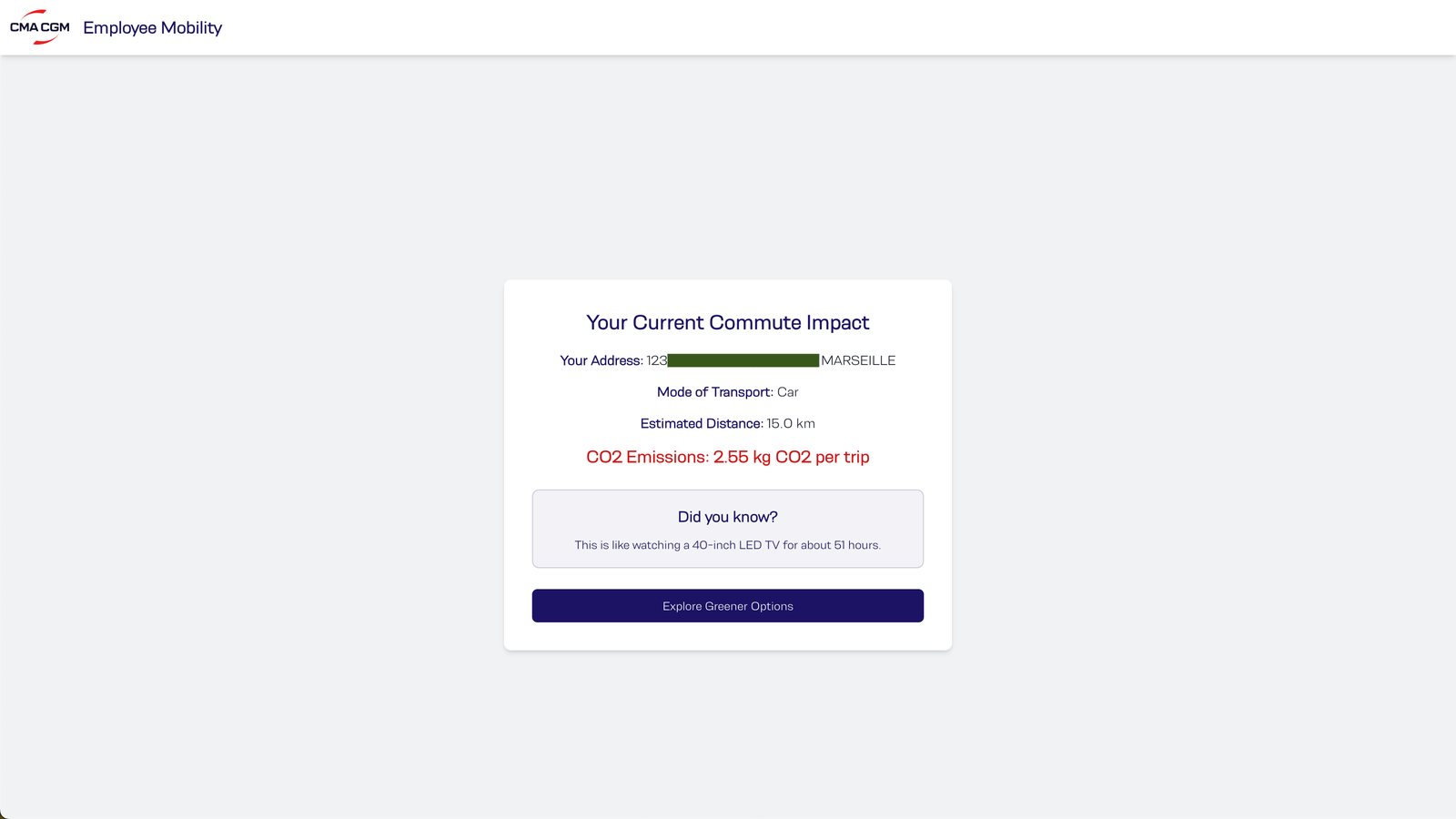
The carbon number comes before the choice.

A personal estimate, with a relatable comparison: 15 km by car a day equals about 51 hours of watching an LED TV. It makes the problem personal before asking for a choice.

Aurélie commutes 45 minutes each way by car, through Marseille traffic, because the metro and tram do not cover the trip. “Living in Marseille, our limited metro and tram lines just don't cover enough ground, and traffic is a nightmare. It feels like public transport just doesn't connect where I live to where I work, leaving me no option but to drive.” She also said a shuttle to the tower would mean less stress, more time, and a real alternative to sitting in traffic. Her needs were a reliable alternative to driving alone, a direct route, a ride comfortable enough to take every day, and room for a childcare drop-off.

05

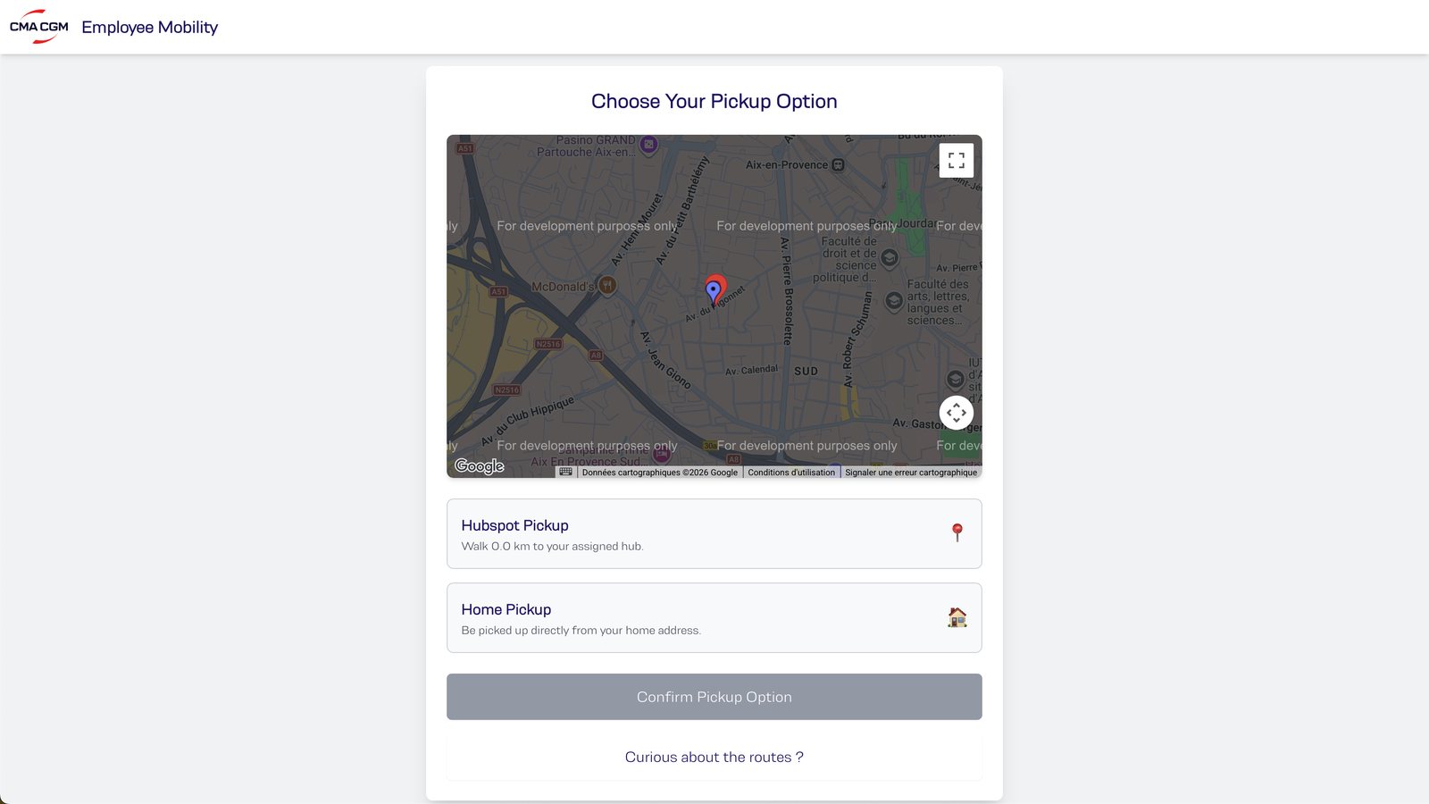
Home, or a short walk. The distance is on the screen.

Home pickup, or walk to a nearby hub with the walking distance shown. Walking under 500 m saves the company money, time and CO₂. Walk-to-hub is a choice, not an obligation. Walking time is shown up front, capped at the 15 minutes the survey supported.

06

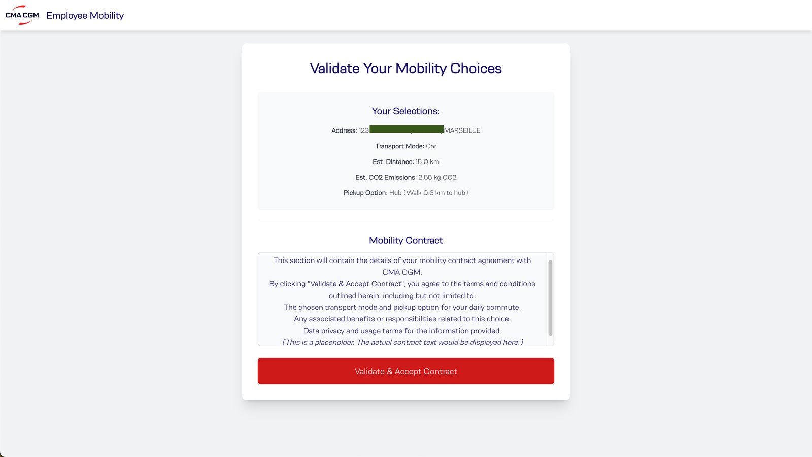
Confirming the ride also signs the contract.

All choices are summarised, plus a mobility contract placeholder, so one click also completes the HR and legal paperwork. Validating in the app signs the mobility contract. HR and Legal don’t chase people separately.

07

Someone standing at the hub needs two things.

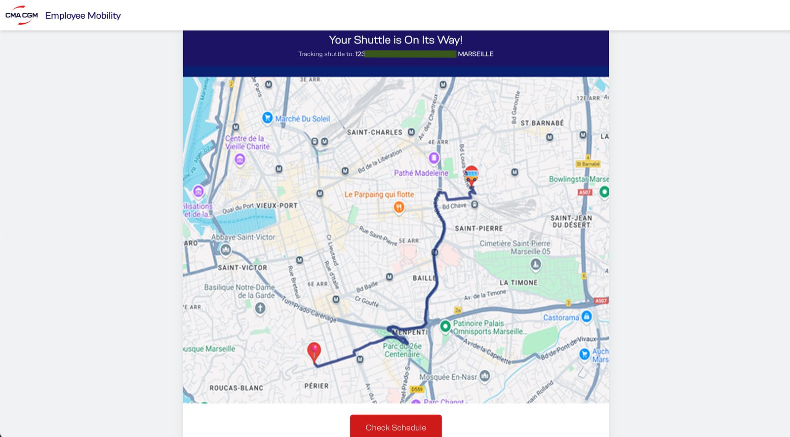
A map showing the shuttle approaching the hub with an estimated arrival, and a “check schedule” button below it. Someone waiting at a stop needs that information, one tap from the map they are already looking at.

08

The jury’s open question was adoption.

83.3% lower commuting CO₂ across the plan. Car commutes are 30% of trips but 60.2% of emissions. Car users who switch cut their own emissions by 88%, public transport users by 77.8%. Coverage of about 95% of 2,729 employees within the 1-hour, 15-minute-frequency model. These are projections.

Jury feedback: adoption was their open question, and they said our approach showed them a proper way to address it. We ran out of time for gamification, miles or bonuses for rides. Next I would test the prototype with real employees. We validated the plan with a survey, and we did not validate the interface.

Full CMA CGM case →
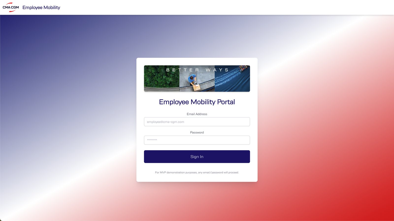
CMA CGM employee mobility loginAddress confirmationCurrent mode of transportPersonal carbon estimate before the choicePickup choice, hub or home, with the walking distanceReview and confirmLive shuttle map and check scheduleAll available CMA CGM shuttle routes around Marseille

Scout · VC fund · Paris

Every lead had to be French.

01

Be first, and be sure they are French.

The fund wanted to be first to contact early-stage French founders the moment they signalled on LinkedIn. Being a French fund was its advantage, so every lead had to be French, with no exceptions.

I worked alongside the COO to create an automated qualified lead finder. We built Scout over 2 months, starting with a local scraper that brought in 30+ daily leads, then finished with hosting and an executive dashboard.

02

The product question was: how do you tell?

Only a name and a job history are available. My solution was a model trained on the INSEE public name rankings that estimates how likely a name is to be French. The client wanted an LLM instead. He insisted “j’y tiens beaucoup”.

I advised against it, because GPT-4o performed poorly on this task, but we built what the client chose. We never measured both approaches’ accuracy. GPT-4o could give a TRUE answer once, and a FALSE answer if you prompt it again on the same profile. No consistency.

03

The interface was a spreadsheet.

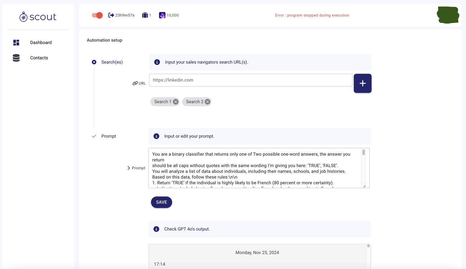
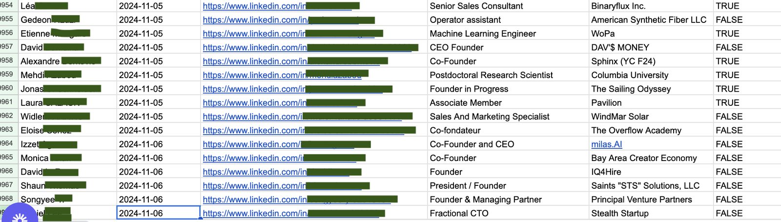
The first version was a black box with no interface. Each day it filled a Google Sheet and posted to a Slack channel when the scraping job finished. The COO already lived in spreadsheets, and was limited in time, so I gave him no new tool to learn. Output was a single TRUE/FALSE per profile, which kept token costs predictable.

04

After a month he wanted to see the machine.

He asked for a V2 with three things: health metrics for the tool, with an on and off switch. An editable GPT prompt, so he could iterate himself. Sales Navigator search URLs as inputs for advanced filters.

He also asked for the AI’s full reasoning in every output. I pushed back because token usage would grow sharply, and I framed it as a cost per lead rather than as no. V2 is the on/off toggle, the search links, the prompt, the model output, and a health check.

05

He ended it. I know the tradeoffs, not the reason.

The spreadsheet and Slack matched how he already worked. TRUE/FALSE was the cheapest output that would scale, and it hides the reasoning. Following the client over my model preserved the relationship, and consistency suffered, and so did satisfaction. The editable prompt and the URL inputs moved the product from a black box to a tool he could configure.

The client ended the service after V2 without giving a reason. I can’t know why. My hypotheses: the LLM’s name accuracy never met his bar, or he found a way to recreate the system with no-code tools he knows, like Zapier.

06

What I would set up before building.

When I’m overruled, I should set a measurable test, such as accuracy on 200 labelled profiles, before building, so the decision rests on evidence rather than on persuasion.

“Minimal” isn’t automatically right. After one month, this user wanted visibility into how the tool worked. I should have offered a simple health view from the start. Cost is a design constraint. Showing what full reasoning would cost per lead is the conversation I would have earlier.

Full Scout case →
LinkedIn Sales Navigator search used to source Scout leadsWiza dashboard used to reveal contact detailsScout output in a spreadsheet, TRUE or FALSE per profileScout output in a spreadsheet, TRUE or FALSE per profileScout output in a spreadsheet, TRUE or FALSE per profileScout output in a spreadsheet, TRUE or FALSE per profile

Winflow · A spin-off of Scout

The real user was one person.

01

Same engine, different job.

I worked alongside a designer to adapt Scout to a growth marketing agency’s lead generation. We created Winflow over 2 weeks, to be the first to find posts and job offers where the agency could join the conversation and propose its services.

02

I designed for a type of company. I had one founder.

It got little traction. I had designed it for “an agency doing prospection” and never studied how he actually worked. Admin-heavy, repetitive tasks pulled against his creative way of working, so a list of signals to review never became a habit.

03

The next version would meet him where he already is.

I would design around his motivation rather than the task. Push high-value signals to him in a message instead of waiting for him to open the dashboard, and present them as something worth acting on quickly, such as “gems”, rather than rows in a list.

Full Winflow case →
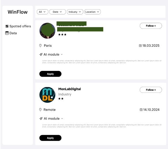
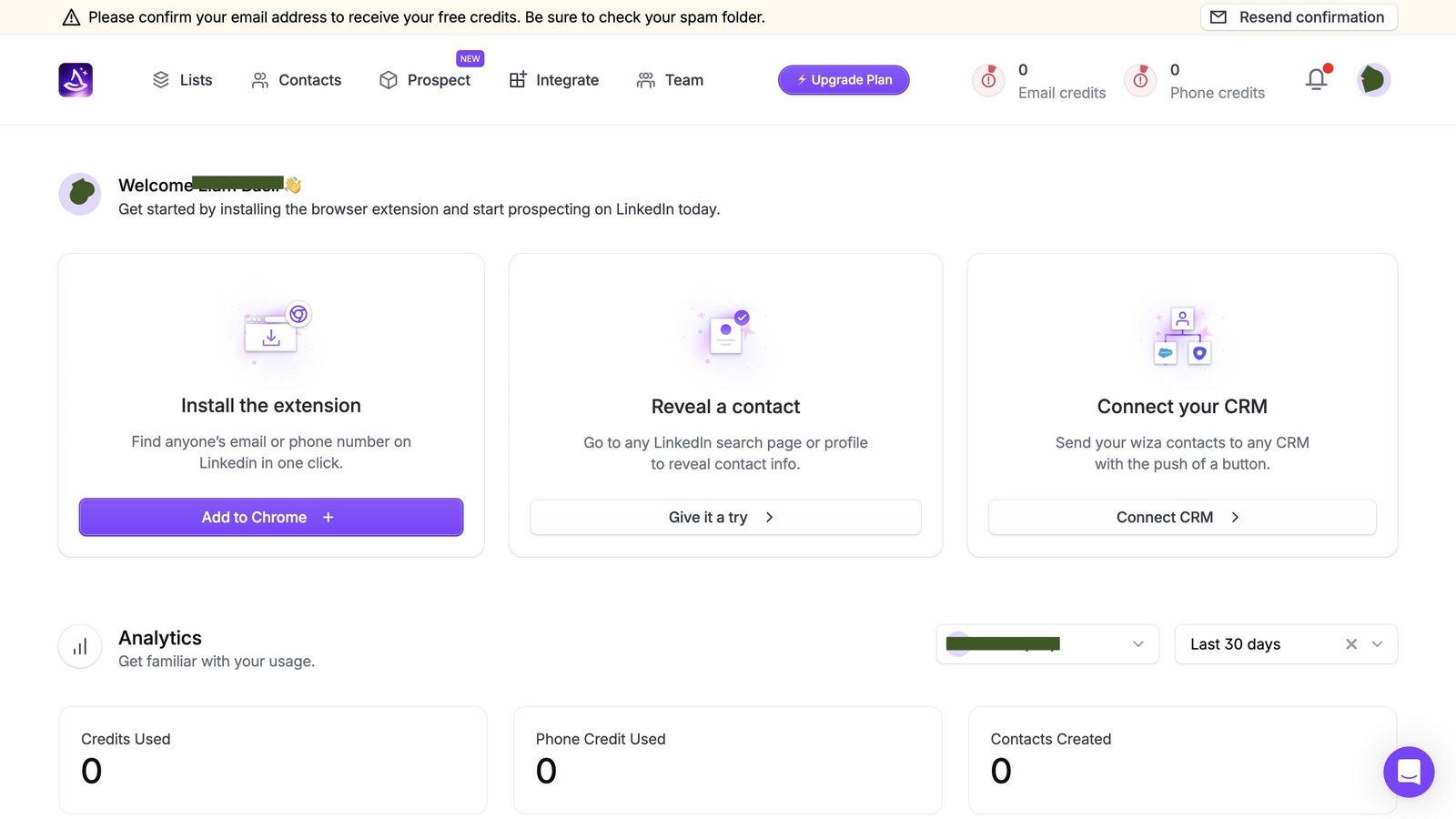
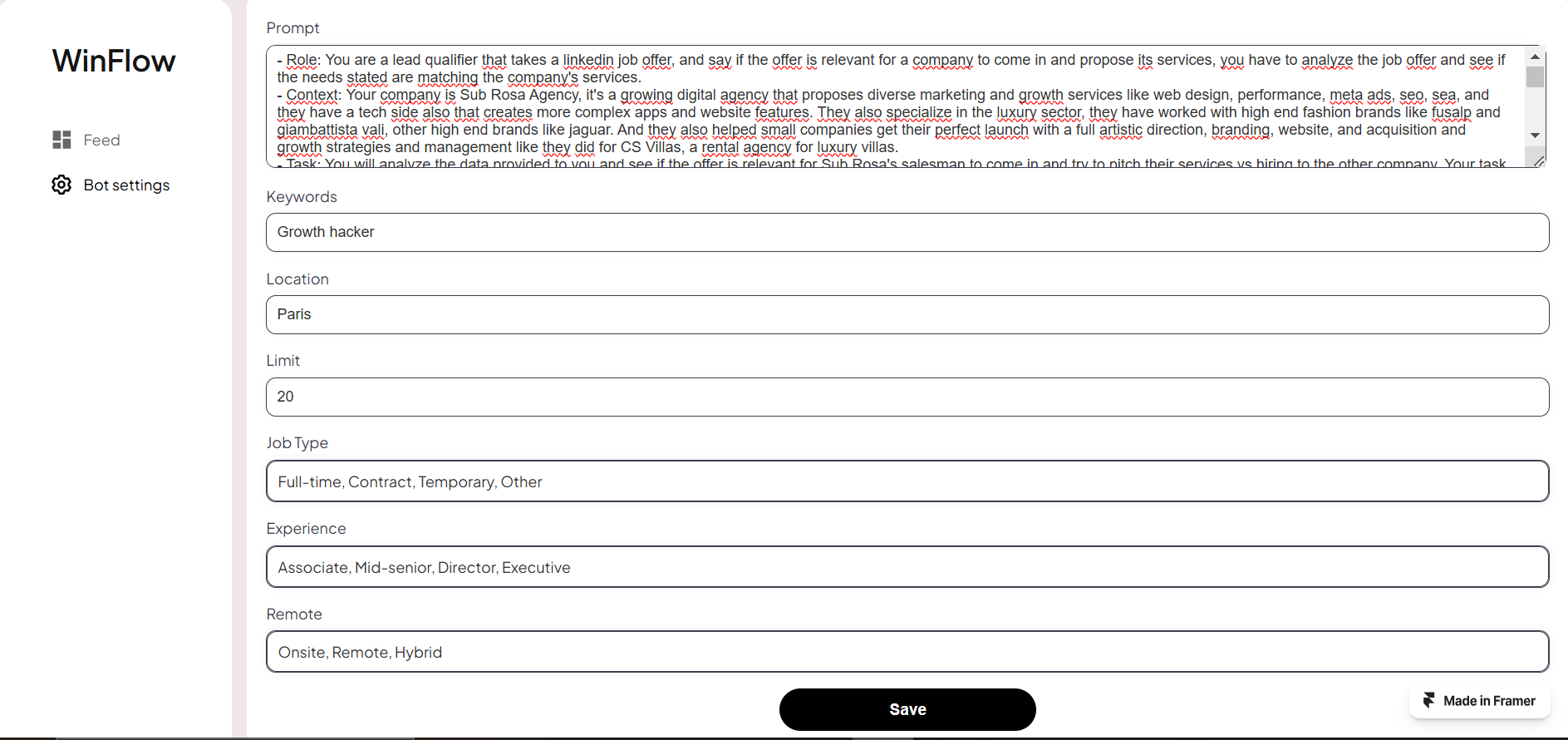
LinkedIn post and job offer Winflow was built to spotWinflow feed of spotted offersWinflow bot settings and prompt

Why am I a good fit for the role.

I have a lot to learn, but I've already applied the process numerous times with different teams and structures, and taking on different hats: find the real problem with the people who have it, design the whole path, build it with whoever is shipping, and look again after it is live.

Situatrack was built through iteration and feedback loops. They wanted thoroughness, not fewer clicks. Then added calendar features, filters, and research. The first product that's being used everyday without fail.

At CMA CGM the data scientists owned the routes. I owned whether anyone would take them. We only had managers in the room, so I co-led a survey of 121 employees in Marseille. Those answers set the price, the walking distance, and the order of the screens to maximize adoption.

Scout was shaped around one COO who already lived in a spreadsheet but wanted control that I wasn't ready to give. Winflow missed because I designed for “an agency” and never studied the founder's habits and why he's not doing these tasks in the first place.

That is the work I want to keep doing beside product, engineering, and data. I am ready for the March 2027 intake.

MSc, 2025

Data for Marketing. Albert School & Mines Paris - PSL. 14.5/20, Mention Bien, equivalent to UK 2:1 or higher.

Languages

French, native. English, C2. Arabic, native.

March 2027

Available for the March 2027 intake. Based in Casablanca, open for relocation.

Get in touch

Available for the March 2027 intake.

Based in Casablanca, open for relocation.

Graduate Programme offices: Barcelona, Dubai, Krakow, Lisbon, London, Madrid.